


RUSKA provides products that bring simple but ingenious solutions to common and pervasive problems our pets go through, and it does it with that "how come this doesn't exist yet?" kinda way.
We were involved in pretty much every part of the brand, from the name to packaging and web design. We even made a few suggestions on product design -- which is something really important we learned about during the proje... actually, I'm getting ahead of myself. Keep scrolling and we'll talk more about it later on.


Hang out with us for long enough and the word "feel" will probably be permanently etched on your brain.
That's the most important thing for us.
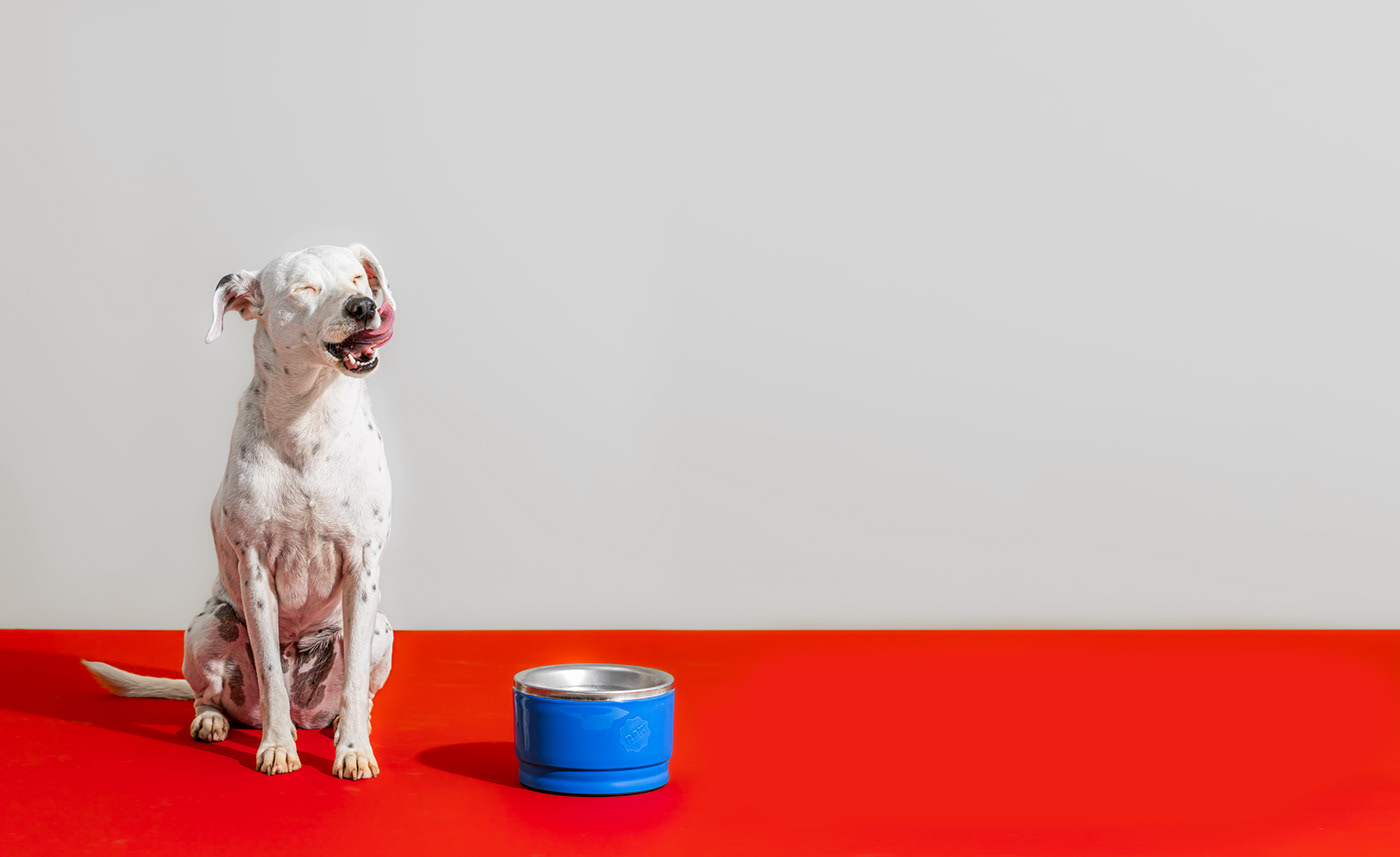
Yeah, we researched how dogs and cats perceived color and we used that concept in the logo (both cats and dogs can't see red, which is the color we used for most of the brand signifiers [dogs don't care about branding, people do]), but at the end of it all, all that really matters is the feeling each part of the brand gives off and how it all adds up in the end.


"The most important things to remember about backstory are that
(a) everyone has a history and (b) most of it isn't very interesting.
Stick to the parts that are, and don't get carried away with the rest."
Stephen King, Writing: A Memoir of the Craft


Here's a good example of how we work together as a team.
The first pass on the mascot design was fine. It was cool. But we felt it missed a little something, a little zhoozh.
It's when the project goes around the studio, going through everybody's hands that it really gets interesting.
With our added skills and perspectives is how our projects get to be look like us.


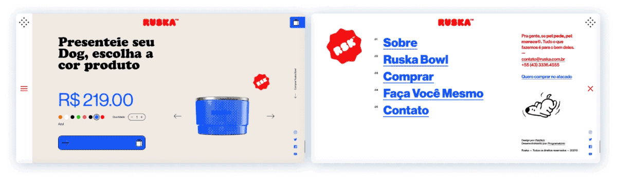
We felt that everything in the brand should be self-explanatory and perhaps the two examples that show that the best are website design and packaging design.
The main focus of the website was to showcase the product and explain how it works.
But another important point (perhaps just as important as the other two points) is to show how the brand feels.
As for the packaging, our idea was to not only showcase the product itself, but also to explain how it works.


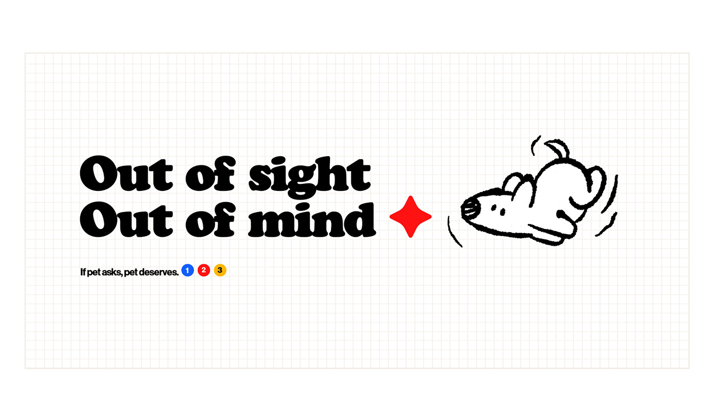
There is a tired idea of what a pet brand should look like. But one thing we do in every single project is to ask ourselves what we can do differently while still speaking our audience's language.
One of the most important things about this project is how varied its visual vocabulary is, mixing different mediums, styles and formats to create something unique in the end.


All of this came together in a brand video.
We are not a video production company and we don't really offer videos as a product but, we feel like we have to be involved in every way a brand can express itself. Plus, we do love working on videos, and this one was a particularly fun challenge.
It was directed by one of our designers, Paulo Doi, with collaboration by Cafeteria Filmes Co.
Another facet of the brand that the video allowed us to further develop was the audio identity.
The soundtrack and sound design brings elements of electronic music, video game inspired sounds, and organic sounds to again, create a unique atmosphere.
AWARDS
LATIN AMERICAN DESIGN AWARDS 2022
BRANDING - SILVER
PACKAGING - SILVER
AWWWARDS 2022
E-COMMERCE OF THE YEAR - SHORTLIST
HONORABLE MENTION
CSS DESIGN AWARDS 2022
SITE OF THE DAY
BRASIL DESIGN AWARDS 2022
BRANDING - BRONZE
PACKAGING - SILVER
MUZLI 2022
FEATURED PROJECT
What we did
Strategy / Brand Identity / Web Design / Motion Design / Product Design / Packaging Design
Team
Gabriel Macohin - Creative Director/ Design/ Illustration/ UI e UX
Paulo Doi - Design/ Illustration/ Motion Design/ Sound Design/ 3D/ Video Direction
Paulo Doi - Design/ Illustration/ Motion Design/ Sound Design/ 3D/ Video Direction
Rafael Alves - Design/ Packaging Design
Bruno Nantes - 3D modeling/ animation
Ber Sardi - Photography
Cafeteria Filmes Co. - Video Production
Programatório - Web Programming


